Watch pet peeves?
I sometimes feel like my ideal watch is less an agglomeration of must-haves, and more a checklist of please-don't-do-its.
You know that feeling of identifying a watch you like on first blush, then running through the spec sheet only to find one of your pet peeves and go right off the idea? How many times have you thought or said, "I'd buy this in a heartbeat if only they hadn't..."
Odds are good I will like or at least respect a watch if it AVOIDS the following relatively minor things:
Unnecessarily long lugs, handsets that lack contrast against the dial, polished bracelet links, poor/inconsistent lume (Hi Oris), lack of AR coating, excessive thickness (say over 11mm for anything that's not a chronograph), unmatched date wheels, double branding (Hi Squale), too much dial text, undrilled lugs OR only offering OEM straps without quick-release, bracelets without micro-adjust...
I could go on but what about the WC community? What are those little things that might move a 'yes' watch into a 'what the hell is wrong with these guys?' watch?
I mean, everyone loves to vent, right?

Watch obsessive who believes smaller and cleaner trumps bigger and flashier. Much first hand love for Tudor, Grand Seiko, Longines, Oris, Hamilton, etc. while pining from afar for Rolex, Patek, VC, et...
Sounds like you might enjoy vintage
$1,000+ watches that can't keep within 10 seconds/day.
Automatics that don't have a manual wind option.
Cyclops on the date window.
Ridiculously overpriced watches, especially ugly ones.
Upside down numbers (Roman numbers, in particular) unless they're on a rotating bezel.
Single hand watches.
Really ugly watches, especially if they're overpriced.
A few more things I can't recall at the moment.
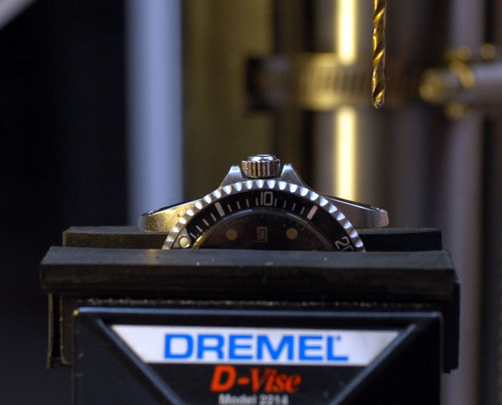
The photo illustrates a necessary step to remove the bezel from my Orient Kamasu. VERY carefully.
I can be flexible on many particulars of a watch. However, there is one factor that I will never accept and turns any ‘yes’ to ‘no’.
Artificially created product unavailablity at MSRP at an AD.
I understand wanting to make a product appear ‘exclusive’. However, I don’t care about these things. If I can’t walk into an AD and buy the watch properly, with full warranty and at MSRP without being required to buy a bunch of expensive junk I don’t want there is no chance I will ever consider the watch. If I’m expected to sign up on an invented ‘wait list’ that is openly a useless waste of time, I am not interested. It’s just a watch, and life is too short for these insulting marketing ploys.
Full stop from a yes to a no. Both Rolex and MoonSwatch are examples of this that sent me to the homage brand Pagani Design and there’s no interest on my part at ever looking back.
Vent you say, what's that?
Vent you say, what's that?
To vent: to express displeasure, to voice annoyance.
If it says Superlative chronometer, it better behave like one, vintage or not
Non-sapphire crystals
Off the shelf movements
Mis-aligned hands
Font clashes (ie california dials)
Gmt hand in between hour and minute hands; That hand better stay at the bottom
Day windows on divers/GADAs
3rd party serviced
Top-side AR coat
HEV’s
fauxtina AND patina
The California dial thing is an odd one. I wouldn't say it's something I totally disagree with but I can also recall plenty of instances of thinking, 'nice watch, shame it's a California...' so I must be more biased than I thought.
1) A ghost date (although there are a few pieces I'll forgive. My CWC G10 and the original CWC diver for starters).
2) The Miyota 8000 series movement. No.
3)16mm + thickness. It's going to be put on a NATO at some point if it lives with me so there's just no point it being outrageously thick anyway.
4) A lug to lug bigger than 47mm. My wrists are reminiscent of Kermit the Frogs, so big l2ls are a no go.
5) Microbrands. One of my favourite things about this hobby is the history behind brands and doing my research, so little kills my interest more than knowing that the watch on my wrist was made by a company founded 3 weeks ago by a bloke from Shropshire called Jerry.
The California dial thing is an odd one. I wouldn't say it's something I totally disagree with but I can also recall plenty of instances of thinking, 'nice watch, shame it's a California...' so I must be more biased than I thought.
This one hurt so much. Shame its actually a nice looking watch for a Rolex, just cant get past the normal numerals on the track and then Roman numerals on the dial…
To vent: to express displeasure, to voice annoyance.
I think that I may have done that once.
Roman Numerals
Cyclops on date windows
Fluted bezels
Too much text
Trying to look too much like a Rolex (particularly a Datejust), looking at you Ricoh, Gruen, and Bulova.
Too much empty space on a dial or numerals and indices that are too small (almost all Longines)
I am sure that I could find more.
Thinking about numerals, I would also add crap, off-the-shelf numeral fonts to the list.
This one hurt so much. Shame its actually a nice looking watch for a Rolex, just cant get past the normal numerals on the track and then Roman numerals on the dial…
Yeah, the Roman numerals feel out of place. Can't say why, but they always feel overly fussy and formal on a watch face. Can't recall a dial that I didn't think would look better in Arabic or with indices.
Roman Numerals
Cyclops on date windows
Fluted bezels
Too much text
Trying to look too much like a Rolex (particularly a Datejust), looking at you Ricoh, Gruen, and Bulova.
Too much empty space on a dial or numerals and indices that are too small (almost all Longines)
I am sure that I could find more.
Least you can rest easy that one of these no longer makes watches and one has disappeared into the mists of time (I have a c. 1970 Ricoh that looks nothing like a Rollie)
It's four strokes instead of three so it takes up more space than necessary. On a watch dial space is at a premium so anything that can streamline things should be considered. It feels lazy at best, willfully obtuse at worst, but bad design anyway you cut it.
https://youtube.com/shorts/NPgrrZt6CYY?feature=shares
Minute Mon covered this a couple of months ago. May not change anyone’s mind, but shed some light on the “Watchmaker’s Four.” Only about a minute long.
I'll add MMDD date format on digital displays.
I understand that this is the correct date format for a minority, but globally saddling the G-Shocks and PrtoTrek users with a USA centric date format without giving us the option to change it to the more intuitive DDMM was a major annoyance and it took 40 years to rectify this with the newer U modules.
Also, negative displays with low contrast and limited viewing angles.
Date windows anywhere besides 3 or 6.
I can be flexible on many particulars of a watch. However, there is one factor that I will never accept and turns any ‘yes’ to ‘no’.
Artificially created product unavailablity at MSRP at an AD.
I understand wanting to make a product appear ‘exclusive’. However, I don’t care about these things. If I can’t walk into an AD and buy the watch properly, with full warranty and at MSRP without being required to buy a bunch of expensive junk I don’t want there is no chance I will ever consider the watch. If I’m expected to sign up on an invented ‘wait list’ that is openly a useless waste of time, I am not interested. It’s just a watch, and life is too short for these insulting marketing ploys.
Full stop from a yes to a no. Both Rolex and MoonSwatch are examples of this that sent me to the homage brand Pagani Design and there’s no interest on my part at ever looking back.
Did anyone notice that once Rolex made it popular to not have stock available, that it was quickly copied by Patek and AP. Even in their boutiques. What's the point of an AP or Patek boutique with no watches on display? I mean what the heck?
Pet hates are; roman numerals unless on a Cali dial, digital or ana-digi and chronographs.
Please feel free to vent. 😁
Anyway, my pet peeve, spending good money for a watch only to discover it runs “worse” than one you spent far less for. Like that Seiko Turtle Ice Diver special US Edition that ran outside THEIR specs, and those ain’t impressive. Back that went and they regulated it, just like they should have done before letting it out of the factory.
No, wait a second! No, my real pet peeve. Manufacturer’s who cheapen up over a few cm’s or fractions of an inch of leather/rubber/fabric/etc. in their straps! Are you listening, Tudor? Every time I buy a Tudor that is on a strap I have to also buy their extra strap! Hey, there goes (almost) another $200. Bracelets normally fit and aren’t steel links more expensive to produce (Hermès leather excepted 🤣)? Yeah, that is my number one pet peeve.
If it don’t fit, I must omit.
Apologizes to Bobby Cochran. 🤪
If no one has posted this so far then here’s a new one, otherwise I’m in agreement…
Hour markers, either Arabic or Roman Numeral, that are partially cut off to make room for subdials. It’s not like the manufacturers made the watch and then said, “Hey, let’s add a subdial here. Oh well, just cut that marker to make room.”
In my opinion, simply replacing the marker with a pip or indice makes the dial look more purposeful and thought out and less like an afterthought.
You're not the first and won't be the last. There's the hope that a few people who work for brands read this stuff and relay it.
Less a pet peeve about watches than watch “influencers”. When folks (Teddy Baldassare comes to mind but he’s certainly not alone) refer to really amazing and storied brands as starter watches or watches for beginners. I understand what they’re getting at but it makes the assumption that all watch collectors and enthusiasts goals are the same or that some brands or product lines are beneath a certain caliber of enthusiast. It would be like calling a Suburban a great starter SUV because it’s not an Escalade or Makers Mark a beginner’s bourbon because it’s not Pappy or TaylorMade because not Titliest or Colt because it’s not Kimber. It’s arrogant in my opinion and really does a disservice to brands and enthusiasts. I have no issue with folks using words like budget-friendly or referring to something as a good introduction to X style of watch. I dunno it’s not something I’ve given much thought too, just something that I see here and there and find annoying.
As far as actual watch pet peeves it would be sub dials that cut into numbers and odd number lug widths.
😊
If there is a date window (my preference is none), it had better be at the 3 or the 6, framed, and well integrated. Nothing worse than a date window that feels like an afterthought.
The bracelet needs to have microadjusts and be comfortable.
Size wise it has to be between 36-40mm with a reasonable lug-to-lug of 48mm or less.
More than a $100? Sapphire crystal is non-negotiable.
Push on case backs, No,
Spec details trying to claim a hardened mineral crystal is actually a thing,
Seiko for making their sports series replacement SKX's without screw-crowns or having sapphire crystals,
Overpriced watches with the NH35 movement
Overpriced watches
Mine...
Snowflake hands
Cut off numerals
Mismatched lume
Yes 👏
Late to the party here, but venting be fun 🤩
All watch manufacturers- heed my hard and fast rules!!!
No cyclops. No warts or growths on a crystal. Ever. Make date decent size and legible. And always have a date. The idea of a GADA watch with no date is insane to me.
Drilled lugs, and 20 or 22mm lug widths
Use Hardened Ti/ Steel , or ceramic. No warm butter soft polished cases and bracelets
47mm max lug width and no male end links from case (tiny wrist club member here)
All watch manufacturers must fully disclose parts and build information in detail. Should be nothing nebulous about Swiss made or Made in Japan
Badly done date windows.
Crown difficult to engage, crown positions difficult to find.
Leather watchband with uncomfortable deployment clasps.
Integrated watchbands, especially of the plastic variety for digital watches.
My pet peeve is with G-Shock when the put plastic buckles on their watches when other color variants of the same model have steel buckles. For the same price. Doesn’t make sense to me.