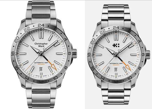
Christopher Ward retrofitting their logo in existing models

In the last loupe magazine, they said that will happen. It is nice to see the results.
I noticed this in a few C63/C60 models:


21 comments
Sort by

Props to them for listening and acting on feedback. They do an excellent job of listening to their buyers.
The new CW logo looks like it ought to be on the side of an ambulance. I will still be hurling jibes at them from the cheap seats.
@cageyjames, @Aurelian like the wise man once said:
I own a few CW watches and, considering the quality of these watches and how much I paid for them, they could even use one old M$ Powerpoint Clipart and I will still think they are great. Please pick the next logo:
Finally!
Note to prospective watch companies- it appears that a large percentage of men don't want another man's name on their watch...
Ugh the black GMT with the logo is a stunner. I'll keep mine with the name but it's tempting.
Logos are not usually deal breakers for me, but I don’t really consider that logo an improvement. It kind of looks like a pixelated printing error or something.
Is it actually better to have both the new logo and the words “Christopher Ward” directly under it? Just like how Rolex wouldn’t just have the crown on the dial
Finally!
Note to prospective watch companies- it appears that a large percentage of men don't want another man's name on their watch...
Oops, there goes my plan of buying a Cartier….
Saving up for one. didn’t bother me before but is also cool to see
I don't know if it is just me but the typography for Christopher Ward had always been WAYYYY too sterile and safe (for me obviously), and as such it always felt like it lacked a bit of character. The watches look brilliant though so major props to the team!
Don’t care for the ink blot. Their previous Chr Ward version was better for me.
These were made by disgruntled CW forum members during the last logo mess.
Finally!
Note to prospective watch companies- it appears that a large percentage of men don't want another man's name on their watch...
☝️THIS 👏ALL👏 DAY 👏EVERY👏 DAY 👏😤
Always makes me think of this...
I find the change to be a MASSIVE improvement.
Finally!
Note to prospective watch companies- it appears that a large percentage of men don't want another man's name on their watch...
This CW issue is more an anglophone problem. As an Italian Speaker person, I don't mind using a Christopher name on the dial (English dude), a Cartier (French dude) or an F. P. Journe (French dude) or an A Lange & Söhne (2 German dudes) and the list goes on and on...
Oops, there goes my plan of buying a Cartier….
This CW issue is more an anglophone problem. As an Italian Speaker person, I don't mind using a Christopher name on the dial (English dude), a Cartier (French dude) or an F. P. Journe (French dude) or an A Lange & Söhne (2 German dudes) and the list goes on and on...
Christopher Ward we’re fools for not choosing their logo wisely and sticking with it. I find it more annoying that the logos change from watch to watch than there name being located at 9:00.
The new CW logo looks like it ought to be on the side of an ambulance. I will still be hurling jibes at them from the cheap seats.
Perhaps it comes from the Ward, as in hospital ward? 🤕
They look all the better for it too, I've always dismissed the brand because of the logo, nows it's changed, a blue C63 arrived today...I do wonder if they should have used the Trident that appeared on some case backs though.