I'm confused about G Shock collabs 🤔

This Pokemon one is the worst example. Pokemon is literally the biggest franchise in the world (bigger than Star Wars etc) and Casio did the most low effort colab I've ever seen.
Pokemon fans like the characters - not the logo.
I mean look at any popular Pokemon product from the past 20 years.
And the strap is not only inedibly ugly (looks like a spandex leotard from the 80s), it doesn't even look like anything from Pokemon media.
No Pokemon game or anime focuses on weird thunderbolts. And no Pokemon media that I've seen is drawn in this style or these colors.
The circles barely even look like PokeBalls. And again they aren't what fans like about the show/games.
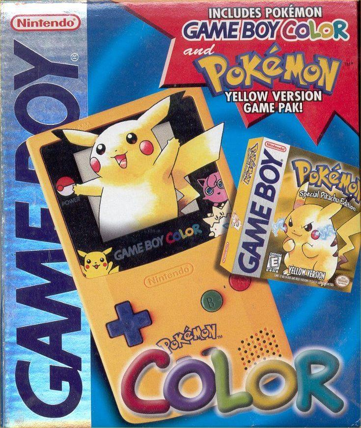
The Gameboy Color game console sold over a hundred million units, and a significant number of them was that Pokemon edition one above. (I didn't find exact sales numbers for it) I even had one myself.
All g shock needed to do was put one or two characters near the screen. They would have sold like hot cakes.
I played a ton of Mario as a kid but I was never a fan exactly. It was just something to play. So maybe true fans can give their opinions.
I feel like instead of a cool colab for G shock fans they made a child's toy. It's just really overkill.
And I don't think a green shell is the most fan favorite part of the franchise to put on the watch face..

And I didn't really understand the recent colab with that graffiti artist. Maybe he has a big audience that will buy the watch? Seems like it's just a G shock with a pattern on the band that isn't really recognizable as anything more than a pattern. I mean it's fine but I just don't get it.


Casio had to get approval from Pokémon to release the watch, maybe that was what both companies wanted. A watch with a subtle Pokémon connection is easier for many people to pull off than a more in your face watch.
Its a huge 42mm watch they want to sell to young people to see a dinner plate on their wrists. They should have gone to Swatch for smaller ones
Casio had to get approval from Pokémon to release the watch, maybe that was what both companies wanted. A watch with a subtle Pokémon connection is easier for many people to pull off than a more in your face watch.
This. In most cases the branding is based on what the company wants to put out there. They are likely far more protective of characters vs. logo.
I think the non-sequitur was an agreed-upon intention by the parties involved.
Reminds me of the Space Invaders watch, back in the day. "Oh wow! What's special about it? Can you play Space Invaders on it?" Um, no, we just have a graphic of Space Invaders on it. That's all.
They sell. There is nothing more to understand.