Patek Philippe 5226G
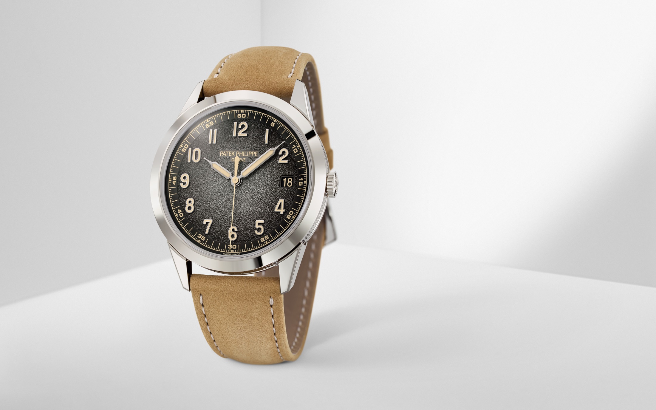
What do folks think about the new Calatrava"field watch"? Are we surprised about this release?
9 comments
Sort by

Glenn
Adventures of a watch tragic.
Member since
Last active: 1 hr ago
7.00” / 17.78 cm
I don't think a field watch can be 39,000 USD. ;) I wanna use it in the field, not buy the field. :)
I don't think a field watch can be 39,000 USD. ;) I wanna use it in the field, not buy the field. :)
I agree! Was referencing the style of the watch rather than anything else.
With opinions split on the LHD GMT Master, I haven't heard Patek fans react the same way to what one might argue, is just as polarising a design.
I think that is my all-time favorite Hamilton Khaki.
I absolutely love it. If I could have any watch, that might be it.
I love it, but @hantms hit the nail on the head here lol. Not exactly the style of watch you expect to see coming from Patek
I got to handle this watch at the show, along with the 5326, and I can tell you they absolutely feel Patek in hand (which is a very good thing). Aesthetically, it's an odd choice and not a direction I particularly care for personally. The aged lume color does not feel on brand for them, and I think had they gone a different direction with the colors used here it would be far more compelling.
That green 5270, on the other hand... whew is that good
I wonder what audience/strategy they had in mind when they conceived this? Because, you're right - it's not an aesthetic that you normally associate with Patek. Dare I say, it looks more inconspicuous (if that can be said at all for Patek) than anything in recent history - you'd almost be hard-pressed to pick it as a Patek, at a glance. Perhaps their version of a "go anywhere, do anything" watch??
I wonder what audience/strategy they had in mind when they conceived this? Because, you're right - it's not an aesthetic that you normally associate with Patek. Dare I say, it looks more inconspicuous (if that can be said at all for Patek) than anything in recent history - you'd almost be hard-pressed to pick it as a Patek, at a glance. Perhaps their version of a "go anywhere, do anything" watch??
It certainly is inconspicuous (as much as a Patek can be), but this case comes off as formal right off the bat, to my eye. There is some great detailing along the case edge and the full polish gives this one more of a "I'm special" vibe than the dial puts off. To me, a watch like the 5164 or 5167 are better GADA type watches (for the exceedingly well heeled/connected at least). This watch is stuck in an odd middle ground, and I'd go for something like the 6119 for a more palatable aesthetic that I'd wear in the same situations as the 5226.
Normally, I'd say it looks like an unwanted bastard child of a Hamilton Khaki Field and a Breguet. Or some microbrand field watch dial and hands placed in a Patek case.
However, from the side it looks like a 1950s roadside diner/burger drive-thru. Hence, I will call it the Burger King Calatrava.