Review: The San Martin SN007-G-X or: Looking for a better 62MAS

I’ve been looking for a modernized 62MAS for quite some time. The original 62MAS was small, simple, and according to Andrea Secco’s excellent guide: affordable. It was a very successful model launch for Seiko and being recognized as their first ever purpose-built diver watch, it also became a collector’s piece that sells for a few thousand US$ even when they are found in less than perfect conditions. What I wanted was a 62MAS built to modern standards and specifications and I had to look outside of Seiko current catalog to find one, to the point where I had to get one from a brand that, unlike Seiko, isn’t exactly known for its originality: Enter San Martin, stage left.
The original 62MAS (from Seiko 62MAS complete guide)
First, I must admit that I already own a Seiko 62MAS re-creation in the guise of the SPB147, which I wear quite regularly. Therefore, any point I will make in favor of the San Martin SN007-G-X isn’t intended to bash the SPB14X line. Rather it’s to explain the reasons behind my opinion that while the SPB14X are among the best that Seiko has in its SPB line, they are not a good 62MAS as the San Martin is. Also, I’m not trying to claim that San Martin SN007 is the only good 62MAS re-creation on the market. It’s just that I don’t own, nor have I tried any other clone.

The SN007-G-X isn’t San Martin first 62MAS homage, their first attempt had a diameter of 40mm, and an NH35A movement. It was sold on AliExpress under various names and versions, sometime with a sapphire crystal, some other time with mineral glass, sometime advertised as not having drilled lugs, while appearing to them in pictures or video reviews. These inconsistencies didn’t appeal to me when Jody from one more watch reviewed it back in 2019, and despite his bold claim that this was “the one that Seiko should have made”, I decided to adopt a wait and see strategy hoping to find something even closer to the original 62MAS, which kind of happened with the launch of the SPB14X line. It wasn’t long after I bought my SPB147 that I found out about the newer and smaller version 62MAS launched in 2022 by San Martin, which is the one I immediately ordered and own since March 2022.

With an official case diameter of 37mm and 38mm at the bezel the SN007 is closer in dimensions to the original 62MAS than either the SPB or even the SLA are. The SN007 thickness of 12.8-13.0mm is also placing it closer to the original 62MAS that was, according to Michael Stockton from Fratello, about 13.5mm tall. To put this into perspective, the SPB147 can be anything between 14.0mm to 14.5mm tall, depending on how it’s measured due to its crystal curvature, but it’s definitively not even close to the deceptive 13.2mm official figure. At least for me the San Martin SN007 has better proportions and its 37mm diameter case makes it more wearable on my 16.5cm wrist.

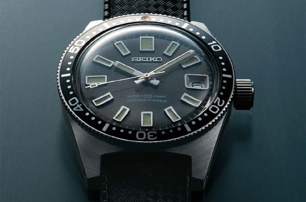
Moving on to the crown, the one on the SN007 is signed with a nicely detailed hexagon logo which match the style of the logo on the dial and the logo on the clasp. Hopefully this indicate that San Martin is on their way to resolve their identity crisis. The SPB147 crown, being a member of the Prospex line, is not signed. Incidentally, the original 62MAS had a crown signed with the Seiko name.

The bezel is a subject open to a discussion whether Seiko or San Martin got the better bezel. The original 62MAS had a miserable bezel by modern standards: A scratch prone painted bidirectional aluminum bezel with a single lumed pip at the 60 minutes marker. The SN007 follows the more modern style of a precise and firm unidirectional 120 click bezel with a glossy ceramic insert. In my opinion they got it almost right because this bezel would be a better 62MAS re-creation with a matte insert instead of a glossy one. The SPB147 does have a matte steel insert but everything else is very different. The bezel is wider, it’s using a thicker font, and the pip is placed inside an inverted triangle – something that is now commonly done with other Seiko divers but wasn’t on the original 62MAS. Its action is also slightly lighter and a bit more elastic in comparison with the SN007. Both felt fine to me, but I prefer the one on the SN007 because it’s visually more alike the one on the 62MAS, while the bezel of the SPB147 looks and feel just like another Seiko diver’s bezel, including its iconic alignment problem.

The dial was a surprising revelation because there is no contest there: The one on the SN007 is a better 62MAS dial with a greyish sunburst, undivided 12 o’clock marker, applied logo and a framed date window – all of which are elements that are present on the original 62MAS. Having a smaller diameter, the dial on the SN0017 has roughly the same blank space surface area further making it like the dial of the original 62MAS. The SPB147 dial, while having more than a passing likeness to the original 62MAS is larger and has more blank space, the logo is printed as if it was an afterthought, the date window is unframed and unbeveled, and it looks like it was just punched with an awl and left unfinished. The Prospex logo is also not helping to beautify the dial but at least on the SPB147 it’s barely noticeable. it was very surprising to look closely at both dials and see that the fit and finish of the sunburst and indices of the SN007 was holding its own against the SPB147, a watch manufactured by a brand with a worldwide reputation for making some of the best dials that money can buy. In the SPB case, Seiko should and could have done a better job.
The hands follow the same line as the dial. They are a bit less well finished on the SN007 than the nicely beveled hands on the SPB14X (they are also gilded on the SPB147), but they are nicely finished on their own and closer in shape and style to the those on the original 62MAS.

The crystal that covered the original 62MAS was of course made of a domed acrylic plastic and in truth I would not mind if a similar one was used for the modern re-creations. We are now however in the 21st century and sapphire is all the rage; therefore, this is what was used for the SN007 and SPB14X. The one on top of the SPB14X is slightly domed while the SN007 features a flat boxed sapphire. Both are AR coated on their bottom surface and both are reasonably free from annoying reflections.

Although not being a lume monster, the SN007 lume is still quite good. It glows in C3 green Super-LumiNova, which is different than the blue torchlike glow of the LumiBrite used on the SPB147. The Seiko has the brighter lume, but the SN007 has a more vintage green glow which I personally prefer in this case.

The case finish is better on the SPB14X and it’s not due only to its hardened DIASHIELD coating. Seiko’s better finish is felt through the fingertips when tracing the contours of the case because San Martin is not as meticulous when dealing with areas that are seldom touched. The edges of the lug’s cutouts and those on the bottom of the case could use a bit more attention, just like the tip of the lugs could be a bit more rounded and less prickly. In summary: the finish of the SN007 is good, but it does not deserve the stellar praise that is heard in some reviews. Speaking of the case, the case back on the SN007 has a shark carved in deep relief while there is the iconic wave of Seiko does its tsunami impersonation on a small roundel in the center of the case back Both are screwed down and both are supposed to help provide a 200m water resistance, but only the SPB14X is ISO certified and branded as a diver’s 200m.

My SN007 came fitted with a bracelet which is typical for San Martin: Sturdy, heavy, good brushing that match the case and a big and thick milled steel clasp with plenty of micro-adjustment. It’s also in my opinion totally wrong, which is why I can’t describe how it feel on the wrist because I never used it, opting instead to fit my SN007 with the excellent FKM rubber waffle strap that should have been offered as an option instead of forcing me to buy it separately. This rubber strap has a very good tang clasp, signed with the San Martin word in a different style, which may indicate that San Martin didn’t resolve their identity crisis after all. My SPB147 is only offered on a rubber strap that is stylish to look at with its single thick large metal large keeper and widely flaring clasp – two elements that made it extremely uncomfortable to wear on my wrist.

The movement concludes this review because there two alternatives for the SN007. The first is a PT5000 and the other a Sellita SW-200. Both are kind of an ETA clone and both ticks at 28,800 BPH. The movement on the SPB14X is the 21,600 BPH 6R35. I opted for the PT5000 for my SN007 and comparing it to other watches that I own that are fitted with a SW-200, I find that it keeps time and perform pretty much the same. Its main downside is due to a harshness bordering on being gritty when hand winding the crown. The 6R35 on my Seiko is another story because it started to drift and is now losing close to a minute and a half every day. It must be my punishment for refusing to accept that the 6R35 is superior to an NH35A. To summarize, the SPB deserve a better movement than the pedestrian 6R35 but being a mid-tier Prospex this is exactly what it got. Meanwhile, the San Martin SN007 is doing fine with a movement that is not very commonly known or appreciated.

Can the SN007 be the 62MAS I was looking for? Probably yes. It has dimensions and proportions that are close to the original 62MAS, it’s speced to modern standards and is built with good materials and has no obvious quality issues. However. It’s more of a tool with a utilitarian look rather than a stylish desk diver but that’s fine for me because I was not looking for a pretty watch to wear: I already have the SPB147 just for playing this role.
Review: The San Martin SN007-G-X or: Looking for a better 62MAS
- Good specifications
- Good build and finish
- Best 62MAS re-creation I found so far
- Only sold with a bracelet
- Finish only so-so in areas that are out of sight and out of touch
- Controversial logo and brand identity problems

I'm a big fan of watches that are interesting because they are either unique, have interesting features, well designed or simply offer a great value for their price.
Very thorough and excellent review